Say Goodbye to “Good Taste”

I’m excited to announce the first release of the ggfx package, a package that brings R native filtering to grid and ggplot2 for the first time. You can install ggfx with:
install.packages('ggfx')The purpose of ggfx is to give you access to effects that would otherwise require you to do some heavy post processing in programs such as Photoshop/Gimp or Illustrator/Inkscape, all from within R and as part of your reproducible workflow.
What is a filter?
A filter, in the context of image/photo editing is a function that takes in raster data (i.e. an image rasterised to pixel values) and modifies these pixels somehow, before returning a new image. As such, the idea has seen a lot of traction with apps such as Instagram which allows you to change the look of your photo by applying different filters to it.
So, a filter works with pixels. That provide some complications for vector based graphics such as the R graphics engine. Here you really don’t care about pixels, but simply instruct the engine to draw e.g. a circle at a specific position and with a certain radius and colour. The engine never comes in contact with the concept of pixels as it delegates the rendering to a graphics devices which may, or may not, render it as a raster. In many ways this is parallel to how SVG works. SVG also just records instructions which needs to be executed by a renderer (often a browser). Still, SVG have access to a limited amount of filters as part of it’s specification — how does that work? Usually when an SVG is rendered and it includes a filter, the filtered part will be rasterised off-screen, and the filter will be applied before it is all composed together.
This is a concept that can be transferred to R, and it is exactly what ggfx does!
Meet the filters!
ggfx contains quite a lot of filters - some are pure fun, others will shock you, a few will prove useful. All filters are prefixed as with_ to indicate that some graphic element should be rendered with the filter. To show this off, lot’s reach for one of the most easy to understand filters: blur!
library(ggplot2)
library(ggfx)

p <- ggplot(mpg) +
  geom_point(aes(x = hwy, y = displ))

with_blur(p, sigma = 3)
We can see that the filter takes a graphic object, along with some filter specific settings, such as sigma which controls the amount of blur applied (specifically the size of the Gaussian kernel being used)
Now, it is not that common that you want to apply a filter to the full plot - thankfully, ggfx supports a range of different graphic objects and filters can thus equally be applied to layers:
ggplot(mpg) +
  with_blur(
    geom_point(aes(x = hwy, y = displ)),
    sigma = 3
  )

Other graphic objects that can be filtered are theme elements and guides:
ggplot(mpg) +
  geom_point(aes(x = hwy, y = displ)) +
  guides(
    x = with_blur(
      guide_axis(),
      sigma = 2
    )
  ) +
  theme(
    panel.grid.major = with_blur(
      element_line(),
      sigma = 2
    )
  )

With the basic API in mind we can take a look at the different filters:
Blur type filters
Blur is central to a lot of effect and thus part of many filters:
-
with_blur()as we have already seen, adds a constant blur to everything in it’s layer -
with_variable_blur()allows you to control the amount and angle of blur at each location based on channel values in another layer -
with_motion_blur()adds directional blur in a manner that simulates moving a camera/moving the subject -
with_inner_glow()adds an inner glow effect to all objects in the layer (basically a coloured blur of the surroundings that is only visible on top of the objects -
with_outer_glow()adds an outer glow effect (a coloured blur of the objects that is only visible in the surroundings) -
with_drop_shadow()add a coloured blur underneath the layer with a specific offset -
with_bloom()adds a specific blur effect to all light parts of the layer that simulates strong light spilling out into the surroundings
Blend type filters
Users of Photoshop and similar programs knows of the power of blending layers. Usually layers are just placed on top of each others, but that is just one possibility.
-
with_blend()allows you to blend two layers together based on both standard Duff-Porter alpha composition types, as well as others known from image editing programs such as Multiply, Overlay, and Linear Dodge -
with_custom_blend()allows you to specify your own blend operation based on a standard formula coefficient setup -
with_mask()allows you to set a mask on a layer, i.e. specify in which areas the layer is visible -
with_interpolate()interpolates between two layers, fading them together
Dithering type filters
Dithering is the act of reducing the number of colours used in an image, while retaining the look of the original colour fidelity. This have had uses in both image size reduction and screen printing, but now is mostly used for the particular visual effect it provides.
-
with_dither()applies error correction dithering using the Floyd-Steinberg algorithm -
with_ordered_dither()uses a threshold map of a certain size to create dithering (also called Bayer dithering) -
with_halftone_dither()uses another type of threshold map that simulates halftone/offset printing -
with_circle_dither()uses and alternative threshold map to the above to create more circular shapes -
with_custom_dither()allows you to use a custom threshold map you’ve created for ImageMagick
Other filter types
There’s also a range of filters that defies grouping:
-
with_shade()allows you to shade a layer based on a given heightmap -
with_kernel()allows you to apply a custom kernel convolution to the layer -
with_displace()allows you to displace and distort your layer based an relative displacement values given in another layer -
with_raster()simply rasterises your layer and displays that
Combining layers
As may be apparent from the descriptions above, filters sometimes work with multiple layers at the same time. To facilitate this ggfx can create layer references and layer group references which can then be used in another filter. We can showcase this with a blend filter. Below we create a reference to a text layer and blends it together with a polygon layer (through geom_circle() from ggforce) to achieve an effect that would be pretty difficult to have without using filters.
library(ggforce)

ggplot() +
  as_reference(
    geom_text(aes(x = 0, y = 0, label = 'Blend Modes!'), size = 20, family = 'Fontania'),
    id = 'text_layer'
  ) +
  with_blend(
    geom_circle(aes(x0 = 0, y0 = 0, r = seq_len(5)), fill = NA, size = 8),
    bg_layer = 'text_layer',
    blend_type = 'xor'
  ) +
  coord_fixed()
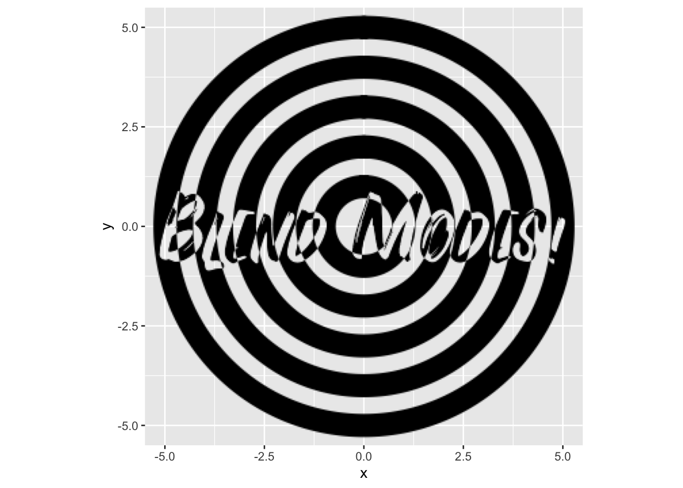
Filters themselves can also be turned into references by assigning an id to them, which allows the result of a filter to be used in another filter:
ggplot() +
  as_reference(
    geom_text(aes(x = 0, y = 0, label = 'Blend Modes!'), size = 20, family = 'Fontania'),
    id = 'text_layer'
  ) +
  with_blend(
    geom_circle(aes(x0 = 0, y0 = 0, r = seq_len(5)), fill = NA, size = 8),
    bg_layer = 'text_layer',
    blend_type = 'xor',
    id = 'blended'
  ) +
  with_inner_glow(
    'blended',
    colour = 'white',
    sigma = 5
  ) +
  coord_fixed()
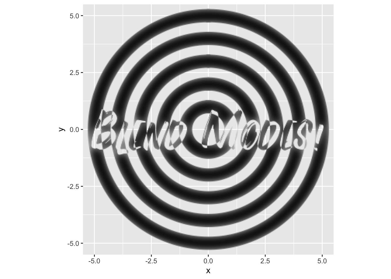
Above we also see that filters can take references as their main graphic object instead of layers.
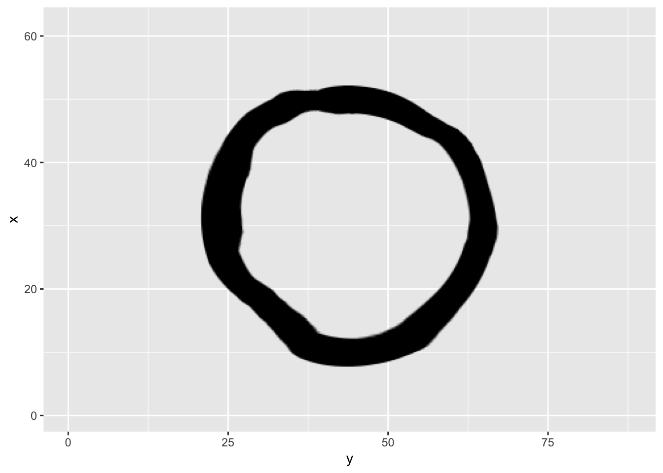
Some filters use other layers but only to extract variable parameters, e.g. seen in with_variable_blur() and with_displace(). Here we are only interested in the values in a single channel as it can be converted to a single integer value for each pixel. ggfx gives you plenty of choice as to which channel to use with the set of ch_ functions which can be applied to the reference. If none is given then the luminosity is used as default. To illustrate this we create a raster layer with the volcano data and applies a rainbow colour scale to it (😱) and then use the red and green channel to displace a circle:
volcano_long <- data.frame(
  x = as.vector(col(volcano)),
  y  = as.vector(row(volcano)),
  z = as.vector(volcano)
)
ggplot() +
  as_reference(
    geom_raster(aes(x = y, y = x, fill = z), volcano_long, interpolate = TRUE, show.legend = FALSE),
    id = 'volcano'
  ) +
  scale_fill_gradientn(colours = rainbow(15)) +
  with_displacement(
    geom_circle(aes(x0 = 44, y0 = 31, r = 20), size = 10),
    x_map = ch_red('volcano'),
    y_map = ch_blue('volcano'),
    x_scale = 5,
    y_scale = 5
  )
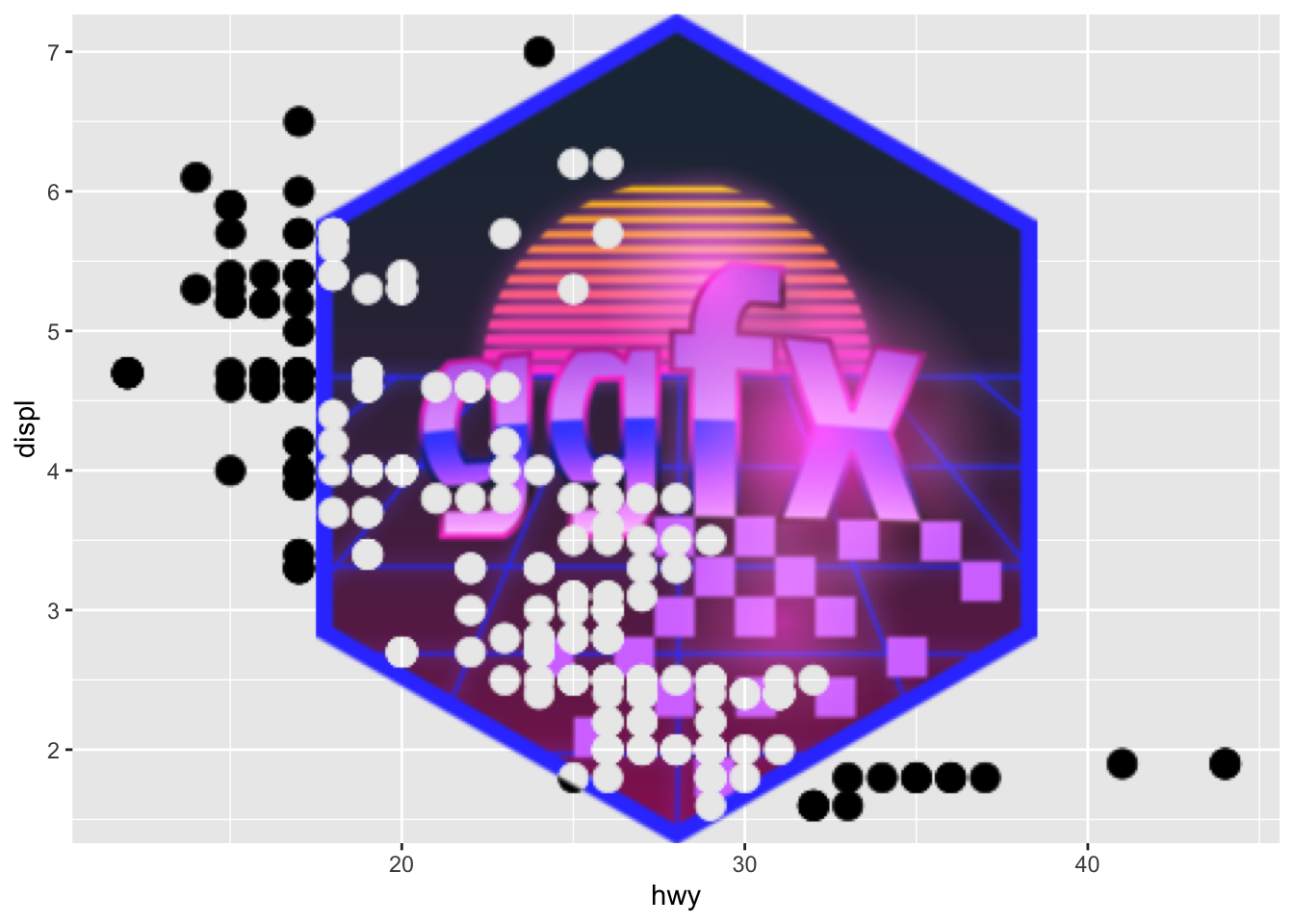
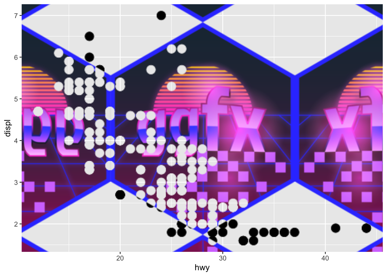
A last wrinkle to all this is that you don’t need to use other layers as references. You can use raster objects directly, or even a function that takes the width and height of the plot in pixels and generates a raster.
When you are using raster objects you can control how they are placed using an assortment of ras_ functions:
ggfx_logo <- as.raster(magick::image_read(
  system.file('help', 'figures', 'logo.png', package = 'ggfx')
))

ggplot(mpg) +
  with_blend(
    geom_point(aes(x = hwy, y = displ), size = 5),
    bg_layer = ras_fit(ggfx_logo, 'viewport'),
    blend_type = 'xor'
  )
ggplot(mpg) +
  with_blend(
    geom_point(aes(x = hwy, y = displ), size = 5),
    bg_layer = ras_tile(ggfx_logo, 'viewport', anchor = 'center', flip = TRUE),
    blend_type = 'xor'
  )
Why, oh why?
Having had a glimpse at what ggfx can do you might sit back, horror struck, asking yourself why I would launch such a full on attack on the purity and simplicity of data visualisation. Surely, this can only be used to impede understanding and, to use a popular term by Edward Tufte, create chart junk.
While there is some truth to the idea that data visualisations should communicate its content as clearly as possible, it is only one side of the coin and mainly applies to statistical charts. Data visualisation is also a device for story telling, and here the visual appearance of the chart can serve to underline the story and make the conclusions memorable. Having the artistic means to do that directly in R, in a reproducible manner, instead of being forced to manually edit your chart afterwards, is a huge boon for the graphic ecosystem in R and will set the creativity free in some data visualisation practitioners. If you doubt me, have a look at how ggfx has been used to great effect in the Tidy Tuesday project - even before it has been released proper.
Wrapping up
I’ve only shown a little glimpse at what ggfx can do — if I have piqued your interest I invite you to browse the package website. There you can see examples of all the different filters along with articles helping you to implement your own filters from scratch for the ultimate freedom.
Now, go out in to the world and make some memorable charts!