The ggforce Awakens (again)
After what seems like a lifetime (at least to me), a new feature release of ggforce is available on CRAN. ggforce is my general purpose extension package for ggplot2, my first early success, what got me on twitter in the first place, and ultimately instrumental in my career move towards full-time software/R development. Despite this pedigree ggforce haven’t really received much love in the form of a feature release since, well, since it was released. One of the reasons for this is that after the first release I began pushing changes to ggplot2 that allowed for different stuff I wanted to do in ggforce, so the release of the next ggforce version became tied to the release of ggplot2. This doesn’t happen every day, and when it eventually transpired, I was deep in patchwork and gganimate development, and couldn’t take time off to run the last mile with ggforce. In the future I’ll probably be more conservative with my ggplot2 version dependency, or at least keep it out of the main branch until a ggplot2 release is in sight.
Enough excuses though, a new version is finally here and it’s a glorious one. Let’s celebrate! This version both brings a slew of refinements to existing functionality as well as a wast expanse of new features, so there’s enough to dig into.
New features
This is why we’re all here, right? The new and shiny! Let’s get going; the list is pretty long.
The Shape of Geoms
Many of the new and current geoms and stats in ggforce are really there to allow you to draw different types of shapes easily. This means that the workhorse of these has been geom_polygon(), while ggforce provided the means to describe the shapes in meaningful ways (e.g. wedges, circles, thick arcs). With the new release all of these geoms (as well as the new ones) will use the new geom_shape() under the hood. The shape geom is an extension of the polygon one that allows a bit more flourish in how the final shape is presented. It does this by providing two additional parameters: expand and radius, which will allow fixed unit expansion (and contraction) of the polygons as well as rounding of the corners based on a fixed unit radius. What do I mean with fixed unit? In the same way as the points in geom_point stay the same size during resizing of the plot, so does the corner radius and expansion of the polygon.
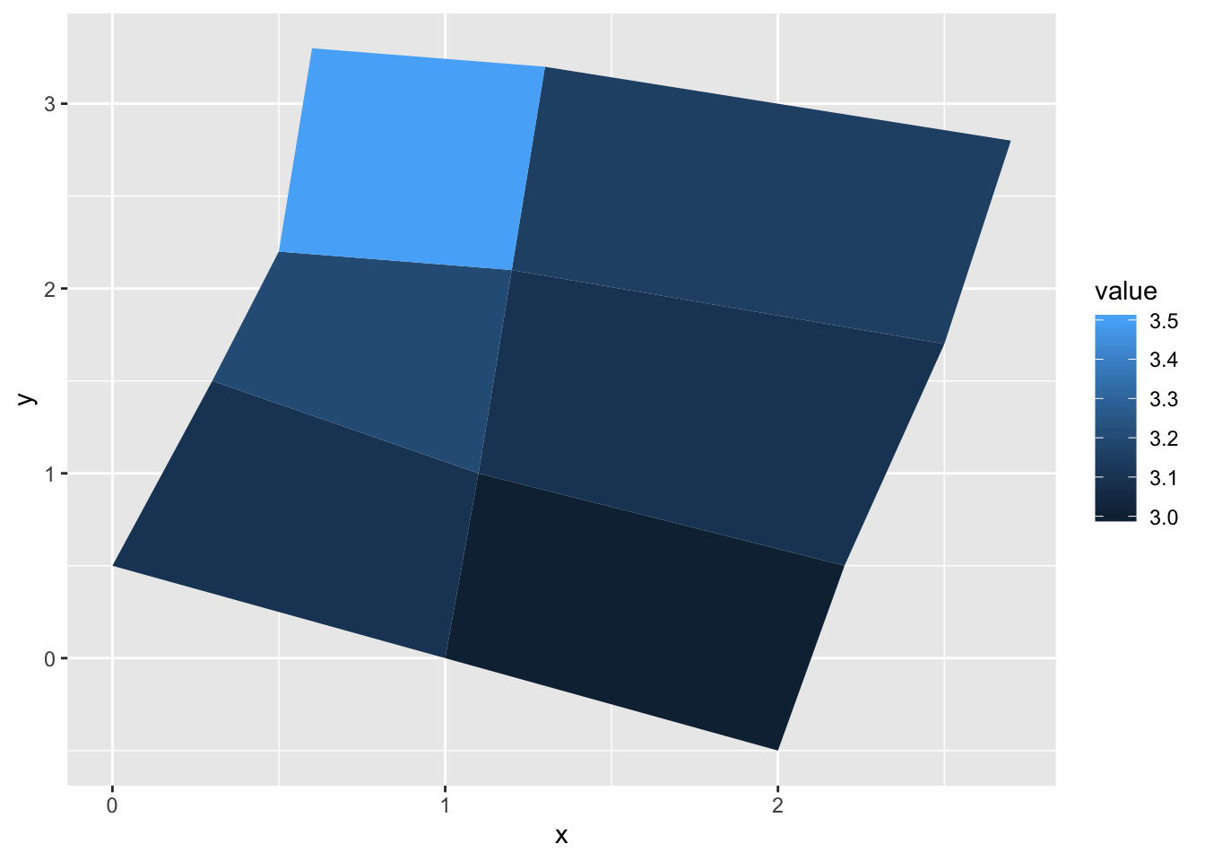
Let us modify the goem_polygon() example to use geom_shape() to see what it is all about:
library(ggforce)

ids <- factor(c("1.1", "2.1", "1.2", "2.2", "1.3", "2.3"))
values <- data.frame(
  id = ids,
  value = c(3, 3.1, 3.1, 3.2, 3.15, 3.5)
)
positions <- data.frame(
  id = rep(ids, each = 4),
  x = c(2, 1, 1.1, 2.2, 1, 0, 0.3, 1.1, 2.2, 1.1, 1.2, 2.5, 1.1, 0.3,
  0.5, 1.2, 2.5, 1.2, 1.3, 2.7, 1.2, 0.5, 0.6, 1.3),
  y = c(-0.5, 0, 1, 0.5, 0, 0.5, 1.5, 1, 0.5, 1, 2.1, 1.7, 1, 1.5,
  2.2, 2.1, 1.7, 2.1, 3.2, 2.8, 2.1, 2.2, 3.3, 3.2)
)
datapoly <- merge(values, positions, by = c("id"))

# Standard look
ggplot(datapoly, aes(x = x, y = y)) +
  geom_polygon(aes(fill = value, group = id))
# Contracted and rounded
ggplot(datapoly, aes(x = x, y = y)) +
  geom_shape(aes(fill = value, group = id),
             expand = unit(-2, 'mm'), radius = unit(5, 'mm'))
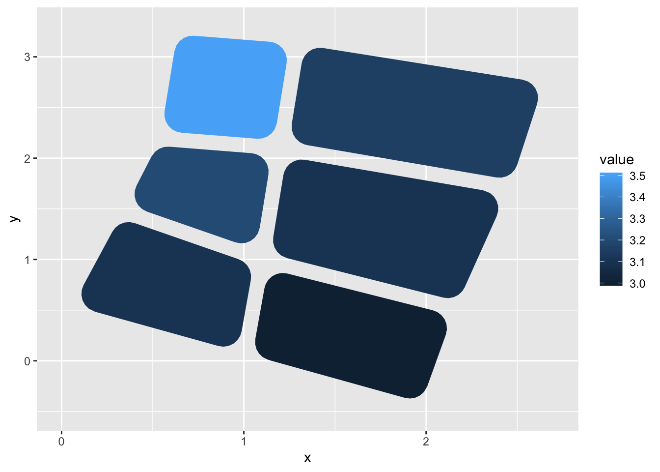
If you’ve never needed this, it may be the kind of thing you go why even bother, but if you’ve needed to venture into Adobe Illustrator to add this kind of flourish it is definitely something where you appreciate the lack of this round-trip. And remember: you can stick this at anything that expects a geom_polygon — not just the ones from ggforce.
More shape primitives
While geom_shape() is the underlying engine for drawing, ggforce adds a bunch of new shape parameterisations, which we will quickly introduce:
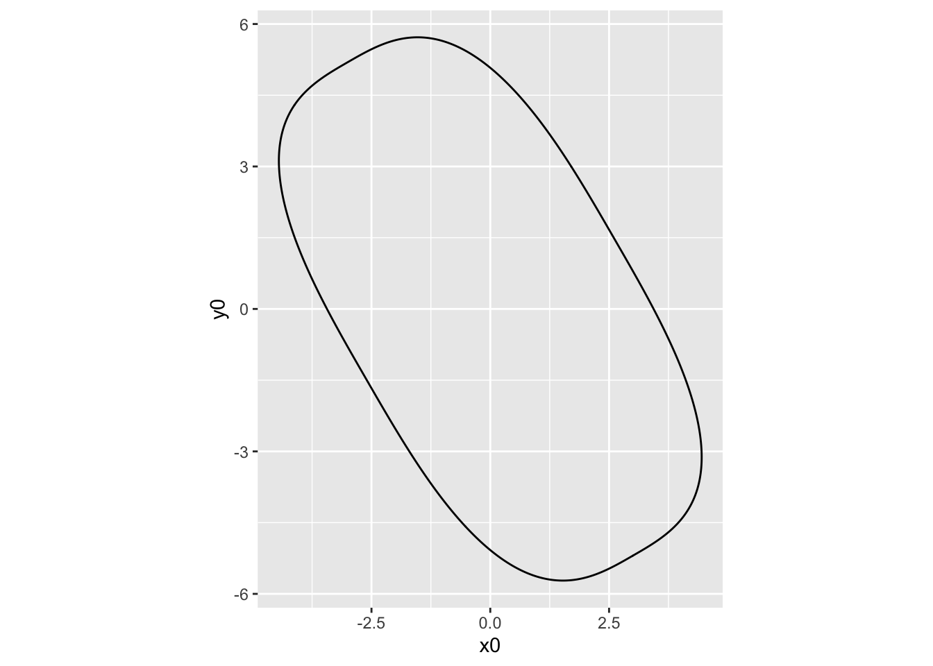
geom_ellipse makes, you guessed it, ellipses. Apart from standard ellipses it also offers the possibility of making super-ellipses so if you’ve been dying to draw those with ggplot2, now is your time to shine.
# Not an ordinary ellipse — a super-ellipse
ggplot() +
  geom_ellipse(aes(x0 = 0, y0 = 0, a = 6, b = 3, angle = -pi / 3, m1 = 3)) +
  coord_fixed()
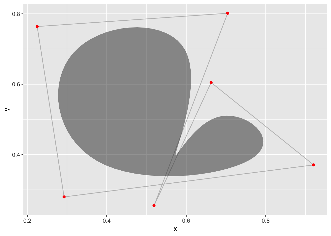
geom_bspline_closed allows you to draw closed b-splines. It takes the same type of input as geom_polygon but calculates a closed b-spline from the corner points instead of just connecting them.
# Create 6 random control points
controls <- data.frame(
  x = runif(6),
  y = runif(6)
)

ggplot(controls, aes(x, y)) +
  geom_polygon(fill = NA, colour = 'grey') +
  geom_point(colour = 'red') +
  geom_bspline_closed(alpha = 0.5)
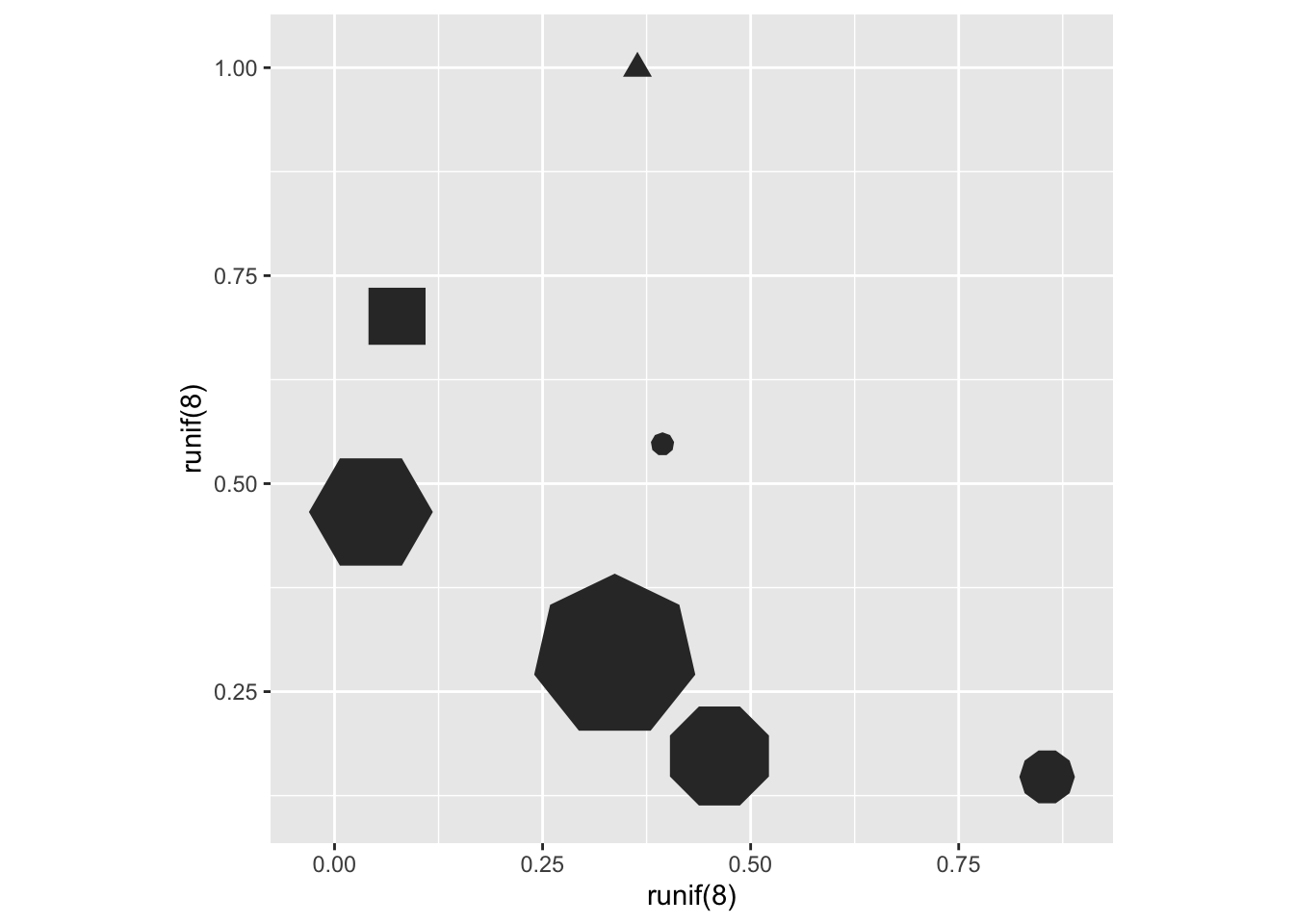
geom_regon draws regular polygons of a set radius and number of sides.
ggplot() +
  geom_regon(aes(x0 = runif(8), y0 = runif(8), sides = sample(3:10, 8),
                 angle = 0, r = runif(8) / 10)) +
  coord_fixed()
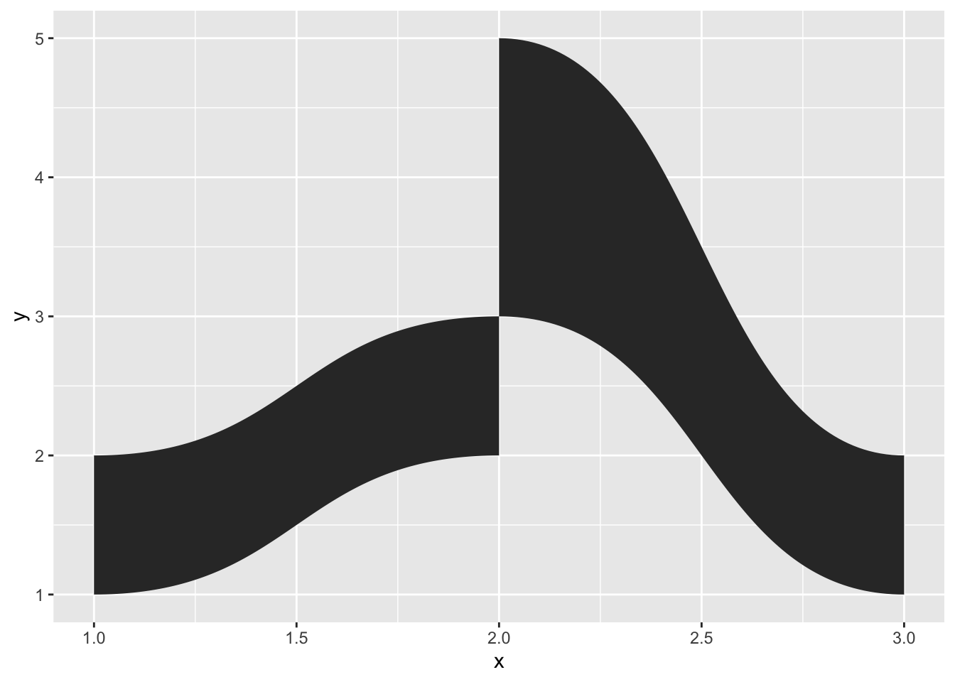
geom_diagonal_wide draws thick diagonals (quadratic bezier paths with the two control points pointing towards each other but perpendicular to the same axis)
data <- data.frame(
  x = c(1, 2, 2, 1, 2, 3, 3, 2),
  y = c(1, 2, 3, 2, 3, 1, 2, 5),
  group = c(1, 1, 1, 1, 2, 2, 2, 2)
)

ggplot(data) +
  geom_diagonal_wide(aes(x, y, group = group))
Is it a Sankey? Is it an Alluvial? No, It’s a Parallel Set
Speaking of diagonals, one of the prime uses of this is for creating parallel sets visualizations. There’s a fair bit of nomenclature confusion with this, so you may know this as Sankey diagrams, or perhaps alluvial plots. I’ll insist that Sankey diagrams are specifically for following flows (and often employs a more loose positioning of the axes) and alluvial plots are for following temporal changes, but we can all be friends no matter what you call it. ggforce allows you to create parallel sets plots with a standard layered geom approach (for another approach to this problem, see the ggalluvial package). The main problem is that data for parallel sets plots are usually not represented very well in the tidy format expected by ggplot2, so ggforce further provides a reshaping function to get the data in line for plotting:
titanic <- reshape2::melt(Titanic)
# This is how we usually envision data for parallel sets
head(titanic)
## Class Sex Age Survived value
## 1 1st Male Child No 0
## 2 2nd Male Child No 0
## 3 3rd Male Child No 35
## 4 Crew Male Child No 0
## 5 1st Female Child No 0
## 6 2nd Female Child No 0# Reshape for putting the first 4 columns as axes in the plot
titanic <- gather_set_data(titanic, 1:4)
head(titanic)## Class Sex Age Survived value id x y
## 1 1st Male Child No 0 1 Class 1st
## 2 2nd Male Child No 0 2 Class 2nd
## 3 3rd Male Child No 35 3 Class 3rd
## 4 Crew Male Child No 0 4 Class Crew
## 5 1st Female Child No 0 5 Class 1st
## 6 2nd Female Child No 0 6 Class 2nd# Do the plotting
ggplot(titanic, aes(x, id = id, split = y, value = value)) +
geom_parallel_sets(aes(fill = Sex), alpha = 0.3, axis.width = 0.1) +
geom_parallel_sets_axes(axis.width = 0.1) +
geom_parallel_sets_labels(colour = 'white')
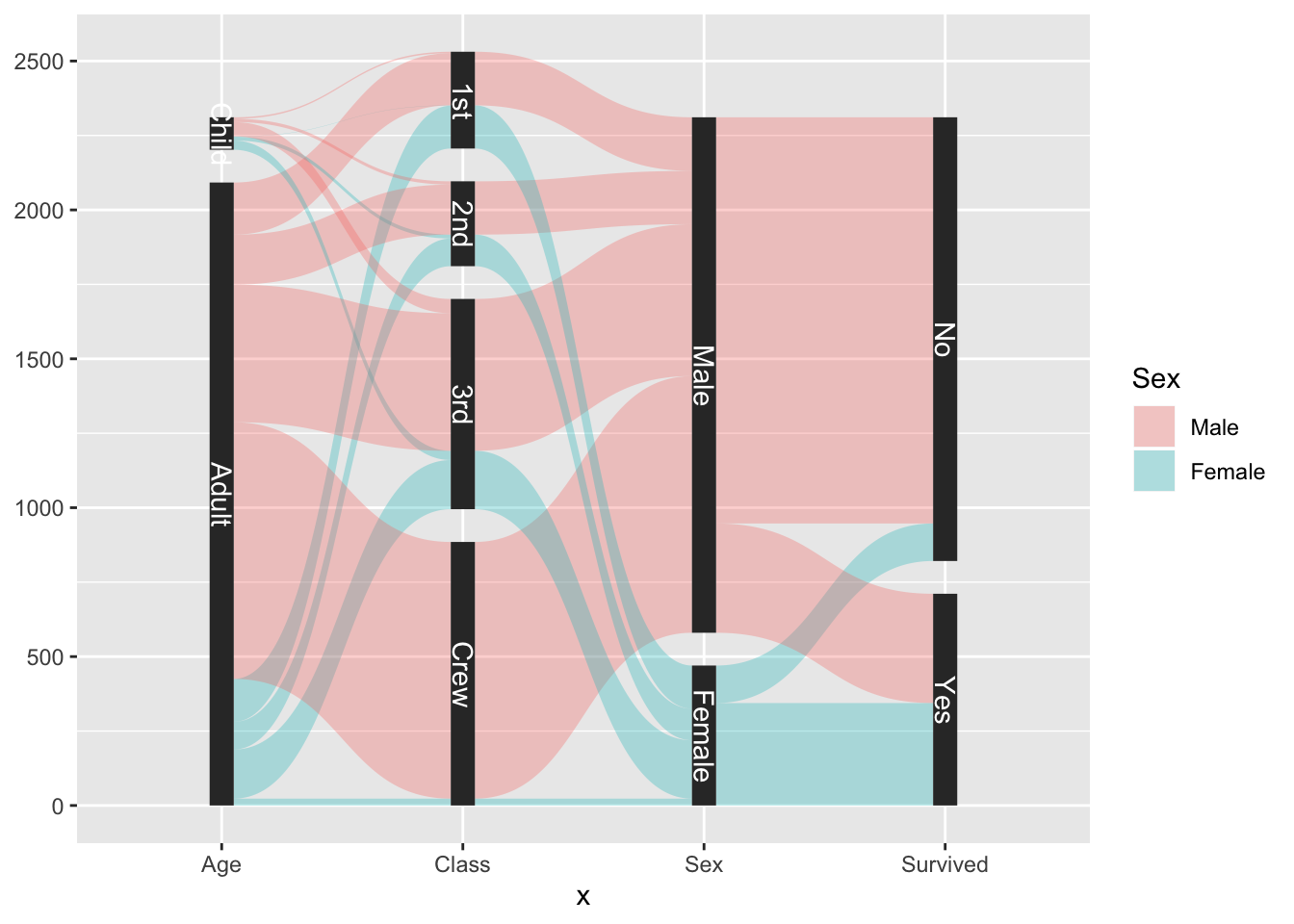
As can be seen, the parallel sets plot consist of several layers, which is something required for many, more involved, composite plot types. Separating them into multiple layers gives you more freedom without over-poluting the argument and aesthetic list.
The markings of a great geom
If there is one thing of general utility lacking in ggplot2 it is probably the ability to annotate data cleanly. Sure, there’s geom_text()/geom_label() but using them requires a fair bit of fiddling to get the best placement and further, they are mainly relevant for labeling and not longer text. ggrepel has improved immensely on the fiddling part, but the lack of support for longer text annotation as well as annotating whole areas is still an issue.
In order to at least partly address this, ggforce includes a family of geoms under the geom_mark_*() moniker. They all behaves equivalently except for how they encircle the given area(s). The 4 different geoms are:
-
geom_mark_rect()encloses the data in the smallest enclosing rectangle -
geom_mark_circle()encloses the data in the smallest enclosing circle -
geom_mark_ellipse()encloses the data in the smallest enclosing ellipse -
geom_mark_hull()encloses the data with a concave or convex hull
All the enclosures are calculated at draw time so respond to resizing (most are susceptible to changing aspect ratios), and further uses geom_shape() with a default expansion and radius set, so that the enclosure is always slightly larger than the data it needs to enclose.
Just to give a quick sense of it, here’s an example of geom_mark_ellipse()
ggplot(iris, aes(Petal.Length, Petal.Width)) +
  geom_mark_ellipse(aes(fill = Species)) +
  geom_point()
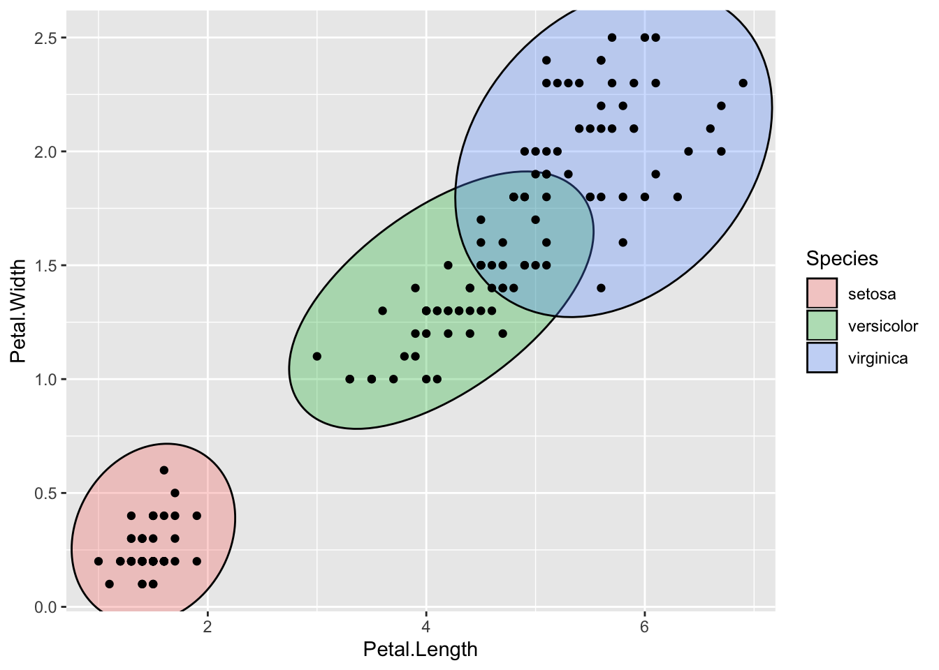
If you simply want to show the area where different classes appear, we’re pretty much done now, as the shapes along with the legend tells the story. But I promised you some more: textual annotation. So how does this fit into it all?
In addition to the standard aesthetics for shapes, the mark geoms also take a label and description aesthetic. When used, things get interesting:
ggplot(iris, aes(Petal.Length, Petal.Width)) +
  geom_mark_ellipse(aes(fill = Species, label = Species)) +
  geom_point()
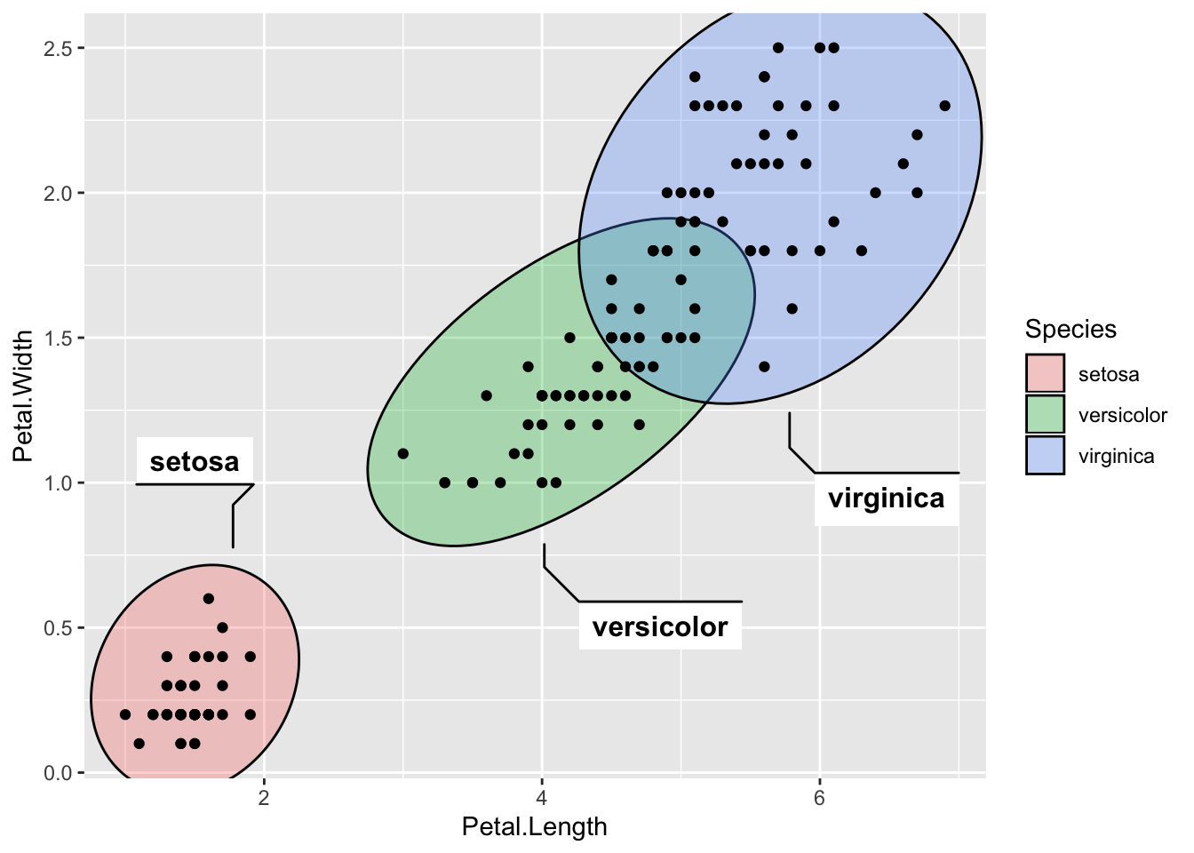
The text is placed automatically so that it does not overlap with any data used in the layer, and it responds once again to resizing, always trying to find the most optimal placement of the text. If it is not possible to place the desired text it elects to not show it at all.
Anyway, in the plot above we have an overabundance of annotation. Both the legend and the labels. Further, we often want to add annotations to specific data in the plot, not all of it. We can put focus on setosa by ignoring the other groups:
desc <- 'This iris species has a markedly smaller petal than the others.'
ggplot(iris, aes(Petal.Length, Petal.Width)) +
  geom_mark_ellipse(aes(filter = Species == 'setosa', label = 'Setosa',
                        description = desc)) +
  geom_point()
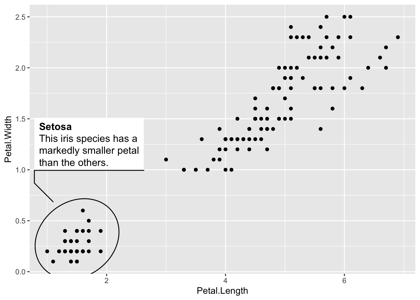
We are using another one of the mark geom family’s tricks here, which is the filter aesthetic. It makes it quick to specify the data you want to annotate, but in addition the remaining data is remembered so that any annotation doesn’t overlap with it even if it is not getting annotated (you wouldn’t get this if you pre-filtered the data for the layer). Another thing that happens behind the lines is that the description text automatically gets word wrapping, based on a desired width of the text-box (defaults to 5 cm).
The mark geoms offer a wide range of possibilities for styling the annotation, too many to go into detail with here, but rest assured that you have full control over text appearance, background, line, distance between data and text-box etc.
Lost in Tessellation
The last of the big additions in this release is a range of geoms for creating and plotting Delaunay triangulation and Voronoi tessellation. How often do you need that, you ask? Maybe never… Does it look wicked cool? Why, yes!
Delaunay triangulation is a way to connect points to their nearest neighbors without any connections overlapping. By nature, this results in triangles being created. This data can either be thought of as a set of triangles, or a set of line segments, and ggforce provides both through the geom_delaunay_tile() and geom_delaunay_segment() geoms. Further, a geom_delaunay_segment2() version exists that mimics geom_link2 in allowing aesthetic interpolation between endpoints.
As we are already quite acquainted with the Iris dataset, let’s take it for a whirl again:
ggplot(iris, aes(Sepal.Length, Sepal.Width)) +
  geom_delaunay_tile(alpha = 0.3) +
  geom_delaunay_segment2(aes(colour = Species, group = -1), size = 2,
                         lineend = 'round')
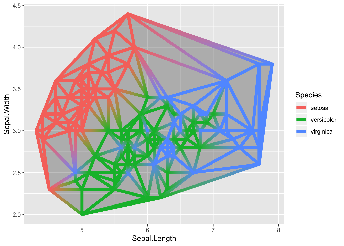
The triangulation is not calculated at draw time and is thus susceptible to range differences on the x and y axes. To combat this it is possible to normalize the position data before calculating the triangulation.
Voronoi tessellation is sort of an inverse of Delaunay triangulation. it draws perpendicular segments in the middle of all the triangulation segments and connects the neighboring ones. The end result is a tile around each point marking the area where the point is the closest one. In parallel to the triangulation, Voronoi also comes with both a tile and a segment version.
ggplot(iris, aes(Sepal.Length, Sepal.Width)) +
  geom_voronoi_tile(aes(fill = Species, group = -1L)) +
  geom_voronoi_segment() +
  geom_point()
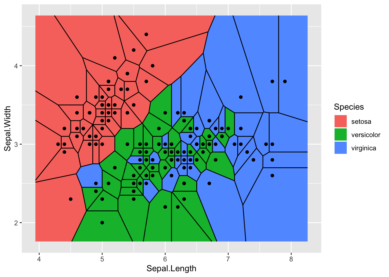
We need to set the group aesthetic to a scalar in order to force all points to be part of the same tessellation. Otherwise each group would get its own:
ggplot(iris, aes(Sepal.Length, Sepal.Width)) +
  geom_voronoi_tile(aes(fill = Species), colour = 'black')
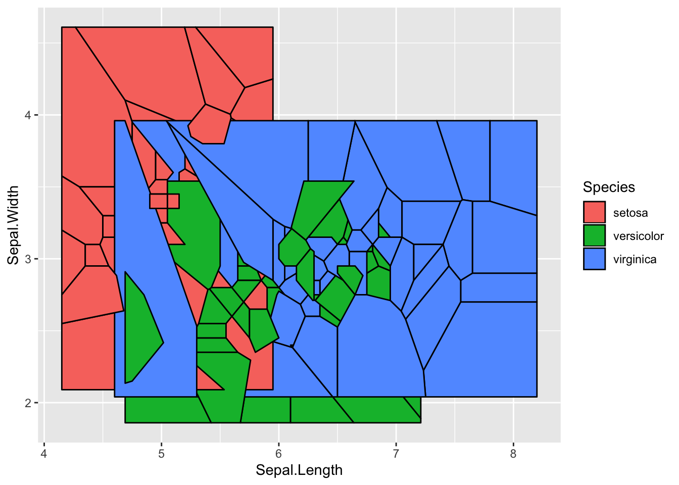
Let’s quickly move on from that…
As a Voronoi tessellation can in theory expand forever, we need to define a bounding box. The default is to expand an enclosing rectangle 10% to each side, but you can supply your own rectangle, or even an arbitrary polygon. Further, it is possible to set a radius bound for each point instead:
ggplot(iris, aes(Sepal.Length, Sepal.Width)) +
  geom_voronoi_tile(aes(fill = Species, group = -1L), max.radius = 0.2,
                    colour = 'black')
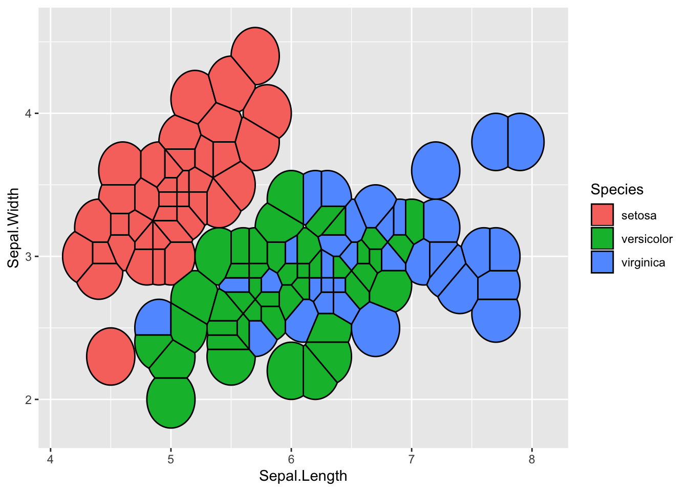
This functionality is only available for the tile geom, not the segment, but this will hopefully change with a later release.
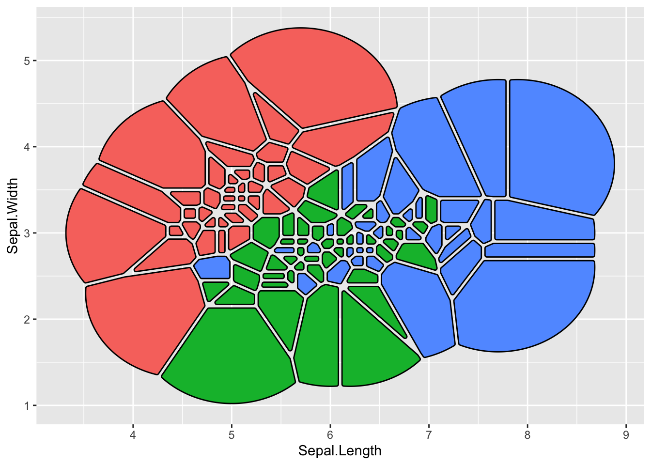
A last point, just to beat a dead horse, is that the tile geoms of course inherits from geom_shape() so if you like them rounded corners you can have it your way:
ggplot(iris, aes(Sepal.Length, Sepal.Width)) +
  geom_voronoi_tile(aes(fill = Species, group = -1L), max.radius = 1,
                    colour = 'black', expand = unit(-0.5, 'mm'),
                    radius = unit(0.5, 'mm'), show.legend = FALSE)
Zoom
Not a completely new feature as the ones above, but facet_zoom() has gained enough new power to warrant a mention. The gist of the facet is that it allows you to zoom in on an area of the plot while keeping the original view as a separate panel. The old version only allowed specifying the zoom region by providing a logical expression that indicated what data should be part of the zoom, but it now has a dedicated xlim and ylim arguments to set them directly.
ggplot(diamonds) +
  geom_histogram(aes(x = price), bins = 50) +
  facet_zoom(xlim = c(3000, 5000), ylim = c(0, 2500), horizontal = FALSE)
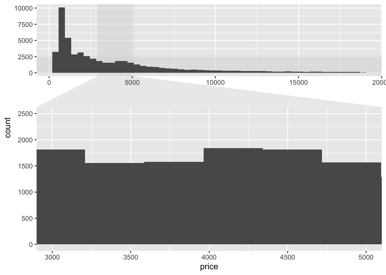
The example above shows a shortcoming in simply zooming in on a plot. Sometimes the resolution (here, bins) aren’t really meaningful for zooming. Because of this, facet_zoom() has gotten a zoom.data argument to indicate what data to put on the zoom panel and what to put on the overview panel (and what to put in both places). It takes a logical expression to evaluate on the data and if it returns TRUE the data is put in the zoom panel, if it returns FALSE it is put on the overview panel, and if it returns NA it is put in both. To improve the visualization above, well add two layers with different number of bins and use zoom.data to put them in the right place:
ggplot() +
  geom_histogram(aes(x = price), dplyr::mutate(diamonds, z = FALSE), bins = 50) +
  geom_histogram(aes(x = price), dplyr::mutate(diamonds, z = TRUE), bins = 500) +
  facet_zoom(xlim = c(3000, 5000), ylim = c(0, 300), zoom.data = z,
             horizontal = FALSE) +
  theme(zoom.y = element_blank(), validate = FALSE)
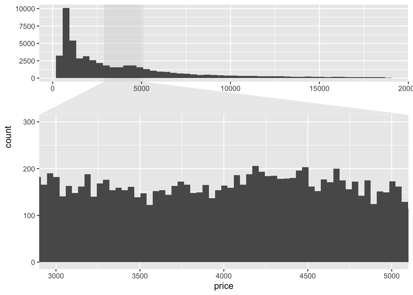
The last flourish we did above was to remove the zoom indicator for the y axis zoom by using the zoom.y theme element. We currently need to turn off validation for this to work as ggplot2 by default doesn’t allow unknown theme elements.
All the rest
The above is just the most worthwhile, but the release also includes a slew of other features and improvements. Notable mentions are
-
geom_sina()rewrite to allow dodging and follow the shape ofgeom_violin() -
position_jitternormal()that jitters points based on a normal distribution instead of a uniform one -
facet_stereo()to allow for faux 3D plots
See the NEWS.md file for the full list.
Further, ggforce now has a website at https://ggforce.data-imaginist.com, with full documentation overview etc. This is something I plan to roll out to all my major packages during the next release cycle. I’ve found that it is a great incentive to improve the examples in the documentation!
I do hope that it won’t take another two years before ggforce sees the next big update. It is certainly a burden of my shoulder to get this out of the door and I hope I can adhere to smaller, more frequent, releases in the future.
Now go get plotting!